RotMG’s artstyle is an inconsistent mixture of different styles from different eras which clash with each other. The original sprites, while fitting for the game in its flash days, stick out like a sore thumb now. They look even worse worse when directly compared to any of the modern sprites. Old sprites barely have any animations, which makes their movements look uncanny and unpolished. However, I also don’t like the artstyle for the upcoming Realm Rework. I can’t say that any sprites particularly look like private servers since I’ve rarely seen private servers, but what I can say is that many of the sprites for enemies and bosses clash with the game’s current artstyle. Some enemies look too cutesy or have a lot of shades for one or two colors. Some bosses are 32c32 and look a bit too detailed for my liking. RotMG is a simple game at its core, so having super detailed sprites for enemies makes it look more complex than it actually is. The only sprites that I actually like are the beacons, which are deserving of their higher detail considering their function, and environmental textures and props. Higher detailed backgrounds contrast with simple sprites, so I’m fine with that.
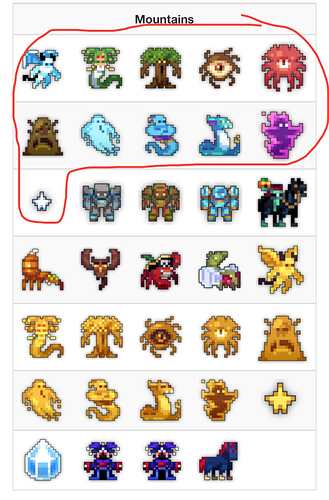
All of the top sprites in the image, and particularly the circled ones, exemplify what I believe to be the perfect art style for RotMG. Maybe the Ghost God is a bit too simple, but otherwise they’re perfect to me. They only have one or two added shades from their original versions which add depth to them. They’re also consistently 16x16 save for the Sprite Child, and they don’t feel too detailed to me. They’re also not too simple that they seem to belong to a completely different era of the game. The Reconstructed Godland enemy sprites hit the sweet spot of detail and size that I believe perfectly resembles RotMG. This should be the standard for RotMG’s art, and I’m actually a bit disappointed in the Realm Rework for replacing this artstyle rather than embracing it. If it did so, then the game would be visually consistent and look nicer.

